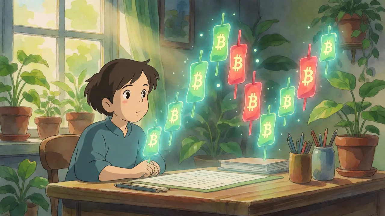
You stare at the screen. Green lines zigzag up, red lines crash down. You feel a mix of excitement and total confusion. You want to buy Bitcoin, but you have no idea if the price is about to soar or plummet. This is the exact moment most new traders panic. They guess. And guessing in crypto is expensive.
Here is the truth: crypto trading charts are not random noise. They are visual maps of human fear and greed. Every line tells a story about what buyers and sellers did in the past, which often hints at what they will do next. You don't need a math degree to read them. You just need to learn the language. Once you understand how to interpret price action, you stop reacting to headlines and start anticipating moves. Let's break down exactly how to read these charts so you can trade with confidence, not hope.
The Three Main Chart Types You Need to Know
Before you look at indicators or patterns, you must choose your canvas. Not all charts show the same information. Using the wrong one is like trying to navigate a city with only street names and no map layout. There are three primary types used in cryptocurrency markets.
Line Charts are the simplest. They connect only the closing prices of each time period with a single line. If you want a quick overview of whether Bitcoin is generally going up or down over the last month, this works fine. It’s clean. It’s easy on the eyes. But it hides critical details. It doesn’t show you if the price spiked wildly during the day before settling back down. For serious trading, line charts are too basic.
Candlestick Charts are the industry standard. About 89% of intermediate and advanced traders use them. Why? Because they pack four pieces of data into one visual element: the opening price, the closing price, the highest price, and the lowest price for that specific time frame. The "body" of the candle shows the range between open and close. If the body is green (or white), the price closed higher than it opened. If it’s red (or black), it closed lower. The thin lines sticking out above and below, called wicks or shadows, show the extreme highs and lows. This gives you immediate insight into market sentiment and volatility.
Bar Charts display similar data to candlesticks but look different. They use vertical lines with horizontal ticks on the left (open) and right (close). Some old-school traders prefer them because they feel less cluttered, but they lack the intuitive color-coding of candles. Most modern platforms default to candlesticks for good reason-they are easier to scan quickly.
| Chart Type | Data Displayed | Best For | Complexity |
|---|---|---|---|
| Line Chart | Closing Price Only | Quick trend overview, beginners | Low |
| Candlestick Chart | Open, High, Low, Close | Detailed analysis, pattern recognition | Medium |
| Bar Chart | Open, High, Low, Close | Traditionalists, minimal visual noise | Medium |
Decoding Candlesticks: The Heart of Technical Analysis
If you master candlesticks, you master 50% of chart reading. Each candle represents a battle between buyers (bulls) and sellers (bears). Here is how to read the story:
- Long Green Body: Buyers dominated. Strong upward momentum. The larger the body, the stronger the conviction.
- Long Red Body: Sellers took control. Significant downward pressure.
- Small Body (Doji): Indecision. Open and close prices were nearly identical. The market is waiting for a catalyst. Often appears at tops or bottoms.
- Long Upper Wick: Buyers pushed the price high, but sellers slammed it back down. Potential rejection of higher prices.
- Long Lower Wick: Sellers drove the price low, but buyers stepped in to push it back up. Potential support level.
Don't look at candles in isolation. Context matters. A long green candle after a week of dropping prices might signal a reversal. The same candle in the middle of a strong uptrend just confirms existing momentum. Always ask: "What happened before this candle?"
Timeframes: Choosing Your Lens
A common mistake beginners make is staring at 1-minute charts. They see every tiny fluctuation as a major event. This leads to emotional trading and excessive fees. Timeframe selection depends entirely on your strategy.
Scalpers (Minutes): Look at 1-minute to 15-minute charts. They aim for small profits many times a day. Requires intense focus and fast execution. Very noisy.
Day Traders (Hours): Use 1-hour to 4-hour charts. They hold positions for hours, capturing intraday swings. Less noise than scalping, still active.
Swing Traders (Days/Weeks): Rely on daily and weekly charts. They hold for days or weeks, aiming to catch larger trends. This is often the best starting point for beginners because there is less noise and more time to think.
Investors (Months/Years): Monthly charts help identify macro cycles. Useful for deciding when to enter a long-term position, but not for timing precise entries.
Pro tip: Use multiple timeframes. Check the weekly chart for the overall trend. Then zoom into the daily or 4-hour chart to find a good entry point. Never trade against the higher timeframe trend unless you have a very strong reason.

Support and Resistance: The Invisible Floors and Ceilings
Prices rarely move in straight lines. They bounce off levels where buyers or sellers historically stepped in. These levels are called support and resistance.
Support is a price level where buying pressure has historically overcome selling pressure. Think of it as a floor. When price drops to this level, it often bounces back up. If it breaks through the floor, it usually falls further until it finds a new, lower floor.
Resistance is a price level where selling pressure has historically overwhelmed buying pressure. Think of it as a ceiling. When price rises to this level, it often gets rejected and drops. If it breaks through the ceiling, it often surges higher.
How do you find them? Look for previous highs and lows on your chart. If Bitcoin bounced off $60,000 three times, that is likely a strong support level. If it struggled to break $70,000 twice, that is resistance. Note that these levels are zones, not exact numbers. A few dollars either side is normal.
Volume: The Truth Teller
Price tells you where the market is. Volume tells you how strongly people believe in that price. Volume bars appear at the bottom of your chart. Green bars mean buying volume was dominant; red bars mean selling volume was dominant.
Why does this matter? Consider a breakout. If Bitcoin breaks above a resistance level, but volume is low, be skeptical. It might be a "fakeout," where the price briefly jumps then crashes back down. However, if the breakout happens with a massive spike in volume, it signals strong institutional interest. That breakout is much more likely to sustain.
A general rule of thumb: Look for volume to increase as price moves in the direction of the trend. If price is rising but volume is declining, the trend is losing steam. A warning sign.

Common Patterns to Spot Early
You don't need to memorize fifty patterns. Start with these three reliable ones:
- Head and Shoulders: A reversal pattern. It looks like a peak (left shoulder), a higher peak (head), and a lower peak (right shoulder). When price breaks below the "neckline" connecting the lows, it signals a potential drop.
- Double Bottom: Looks like a "W." Price drops, bounces, drops again to a similar level, then bounces higher. It suggests sellers are exhausted and buyers are taking over. A bullish reversal signal.
- Bullish Engulfing: A small red candle is followed by a large green candle that completely "engulfs" the body of the previous red one. It shows buyers suddenly overwhelmed sellers. Often marks the end of a short-term downtrend.
Remember, patterns fail. No pattern works 100% of the time. In crypto, volatility can invalidate a perfect-looking pattern in minutes. Always wait for confirmation-like a candle closing beyond a key level-before acting.
Pitfalls to Avoid
Even with good knowledge, beginners fall into traps. Here are the big ones:
- Overcomplicating Charts: Don't add ten indicators. Start with price action and volume. Add moving averages later if needed. Cluttered charts lead to decision paralysis.
- Ignoring the Bigger Picture: Trading on a 5-minute chart while the daily trend is strongly bearish is dangerous. You're fighting the tide.
- Finding Patterns Everywhere: Humans are wired to see shapes. Sometimes a random squiggle isn't a "cup and handle." If it requires mental gymnastics to fit the pattern, it probably isn't one.
- No Stop-Loss: Reading charts helps you predict, not guarantee. Always set a stop-loss order to limit losses if your analysis is wrong.
Learning to read charts is a skill, not a talent. It takes practice. Start by observing daily charts without trading. Write down what you think will happen next. Check back in a day. Did you get it right? Adjust your thinking. Over time, your eye will sharpen, and the chaos will start to make sense.
What is the best timeframe for beginner crypto traders?
For beginners, the daily timeframe is usually best. It filters out the noise of minute-by-minute fluctuations and provides a clearer view of the overall trend. Swing trading on daily charts allows you to make decisions calmly without the stress of constant monitoring required by shorter timeframes like 15-minute or 1-hour charts.
Do I need paid software to read crypto charts effectively?
No, you do not. Platforms like TradingView offer robust free tiers that include candlestick charts, volume indicators, and basic drawing tools. These are sufficient for learning and executing most retail strategies. Paid plans offer more indicators and historical data depth, but they are not necessary for mastering the basics of chart reading.
Why do candlestick colors sometimes seem misleading?
Candlestick colors indicate the relationship between the opening and closing price of that specific period, not necessarily the change from the previous period. A green candle means the price closed higher than it opened during that interval, even if the current price is lower than yesterday's close. Understanding this distinction prevents misinterpreting short-term momentum versus longer-term trends.
How important is volume in confirming price movements?
Volume is critical for validation. A price move accompanied by high volume indicates strong participation and conviction from market participants, making the move more likely to sustain. Conversely, a price move on low volume may lack substance and could reverse quickly. Always check volume bars alongside price action to assess the strength of a trend or breakout.
Can chart patterns guarantee profit in crypto trading?
No, chart patterns cannot guarantee profit. They provide probabilities, not certainties. Market conditions, news events, and liquidity issues can cause valid patterns to fail. Successful traders use patterns as part of a broader strategy that includes risk management, such as setting stop-losses and managing position sizes, rather than relying on patterns alone.





liam & the bees
September 2, 2026 AT 03:56 AMSpot on with the daily timeframe advice for beginners. I've seen too many folks in Dublin get wrecked staring at 1-minute charts. Stick to the bigger picture and you'll sleep better at night.
Edward Ogunfolaju
September 3, 2026 AT 00:14 AMStop guessing! The market doesn't care about your feelings. Learn the candles or get liquidated. It's that simple. You need to treat this like a business not a casino. If you can't read the wicks you're just donating money to whales.
Liam Grimes
September 4, 2026 AT 01:02 AMGreat guide but honestly most people ignore volume until they blow up their accounts. Its the truth teller mentioned here is key. Also dont forget support and resistance are zones not lines so give it some room to breathe.
Matthew O'Neill
September 4, 2026 AT 06:36 AMThis article perpetuates the dangerous myth of technical analysis being a science. In reality, retail traders are merely providing exit liquidity for institutional algorithms. The 'patterns' described are nothing more than cognitive biases projected onto random noise. Until one understands order flow imbalance and delta divergence, discussing candlestick colors is akin to reading tea leaves. The market is an adversarial environment designed to extract alpha from the uninformed. Stop looking for magic bullets and start understanding microstructure.
J Shepherd
September 4, 2026 AT 17:29 PMI appreciate the focus on risk management here. Too many newbies skip the stop-loss step because they think they know better. Keep it simple with price action first. Don't clutter your chart with ten indicators that contradict each other. Master the basics before trying to be fancy.
Alan Hawkins
September 4, 2026 AT 21:17 PMAgreed on the TradingView recommendation. The free tier is plenty for learning. I started with line charts just to see the trend then switched to candles once I understood the concept of open close high low. Takes time to train your eye but it clicks eventually.
Dave Worth
September 5, 2026 AT 16:14 PMThey want you to look at the chart so you don't look at the blockchain data 🕵️♂️📉🤫 The patterns are fake signals created by HFT bots to trap retail. Real moves happen off-exchange. Wake up sheeple. 🐑💸
Matt Reckdenwald
September 6, 2026 AT 16:40 PMThis hits home. I remember feeling exactly that mix of excitement and confusion when I first started. It’s overwhelming, but knowing that every candle tells a story of human emotion really helps demystify the chaos. We’re all just trying to find our footing in this wild digital landscape, aren’t we? It’s okay to feel lost at first; the clarity comes with patience and practice.
Emmanuel Ogbomo
September 7, 2026 AT 04:52 AMCharts are just reflections of collective consciousness. When fear dominates, red candles form. When greed takes over, green ones appear. It is not about predicting the future but understanding the present mood of the crowd. Simplicity is wisdom here. Do not overanalyze.
Laine Van Sickle
September 8, 2026 AT 00:45 AMugh finally someone says what everyone knows but wont admit. most of this stuff is useless if u dont have discipline. i tried trading for 3 months and lost everything bc i kept moving my stop loss. its not the chart its me. sorry for ranting but its true.
Teresa Watson
September 9, 2026 AT 08:18 AMboring as hell. everyone already knows this. why write another generic guide? just trade based on gut feeling and news. charts are for people who cant handle volatility. im making bank without them
Matthew O'Neill
September 9, 2026 AT 08:49 AMThe emotional vampire comment above is ironically correct in its despair but lacks analytical rigor. Discipline is not a personality trait; it is a mechanical constraint enforced by position sizing. Without strict adherence to risk parameters, no amount of 'gut feeling' or 'chart reading' will prevent ruin. The market does not reward hope; it rewards probability management.